UI/UX
CliniClick Redesign Concept
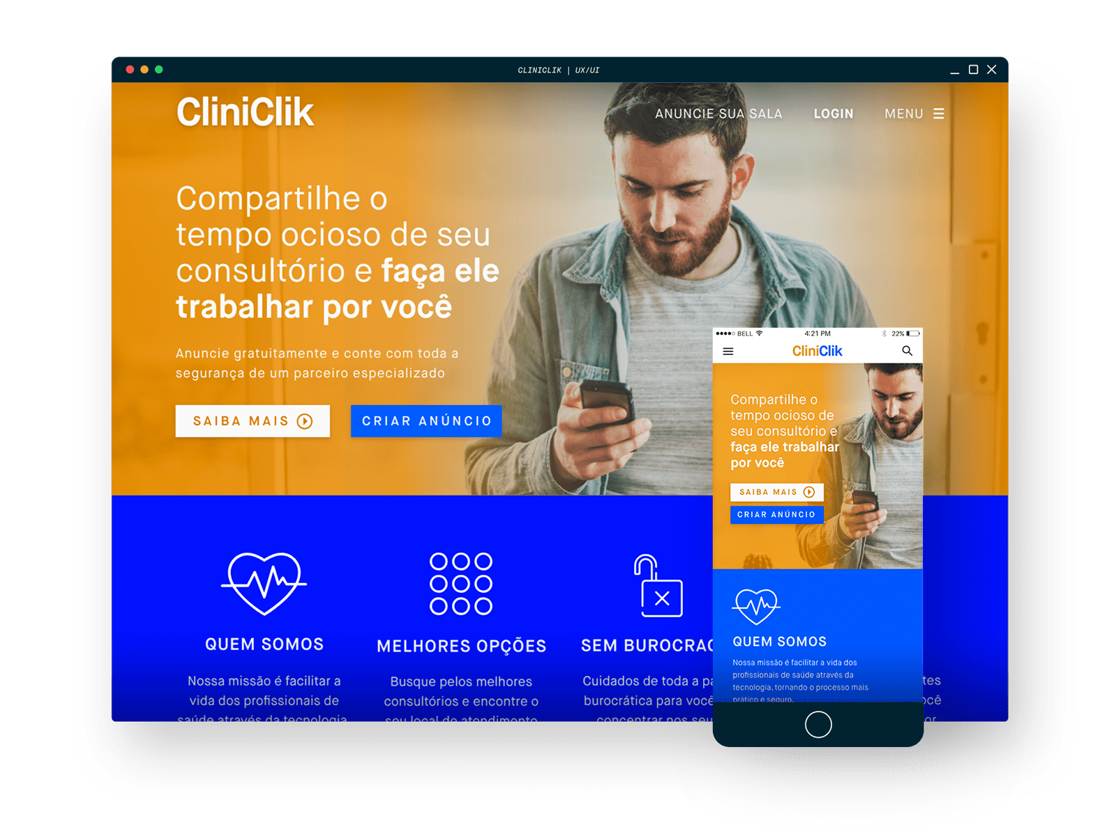
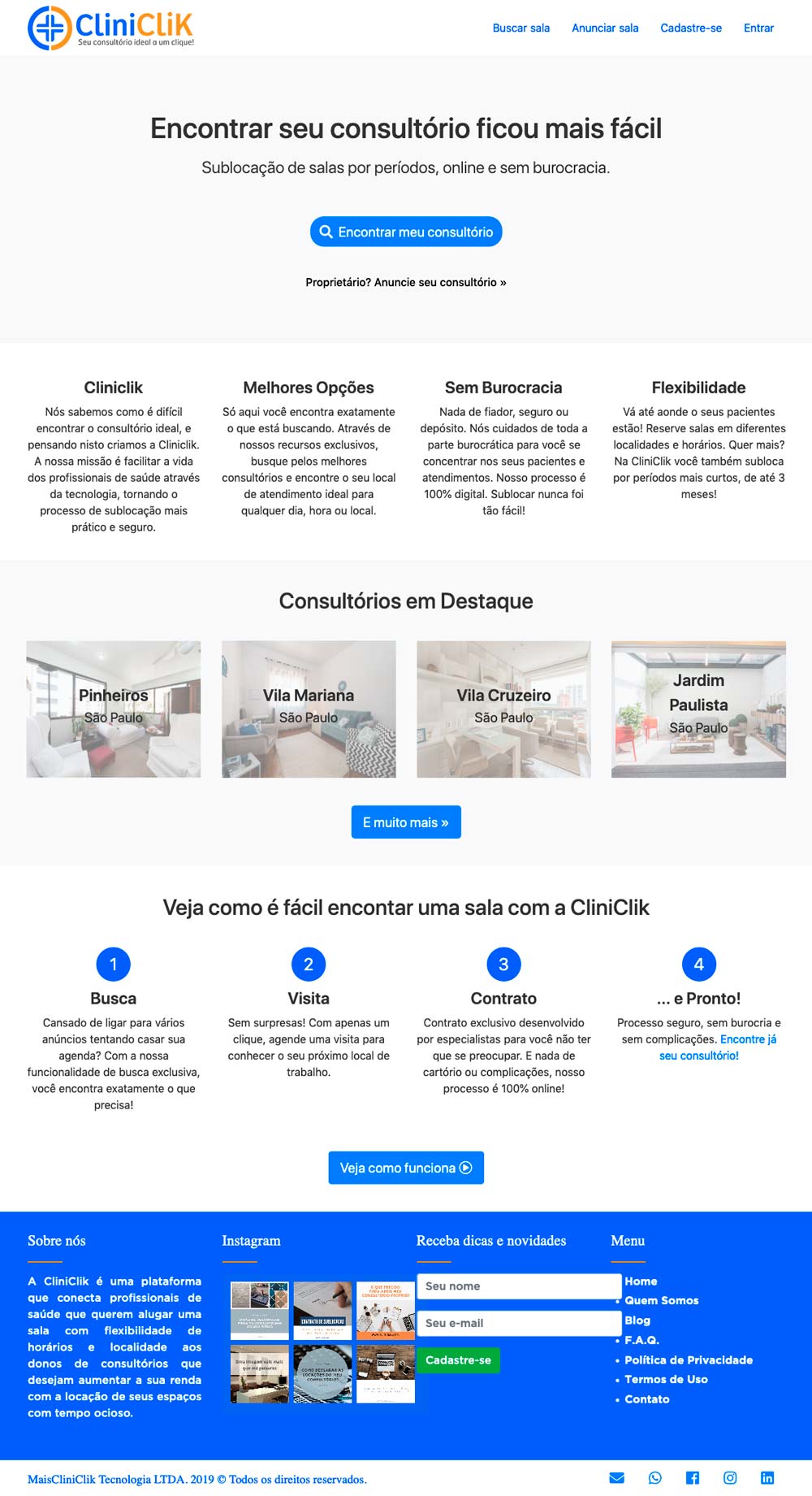
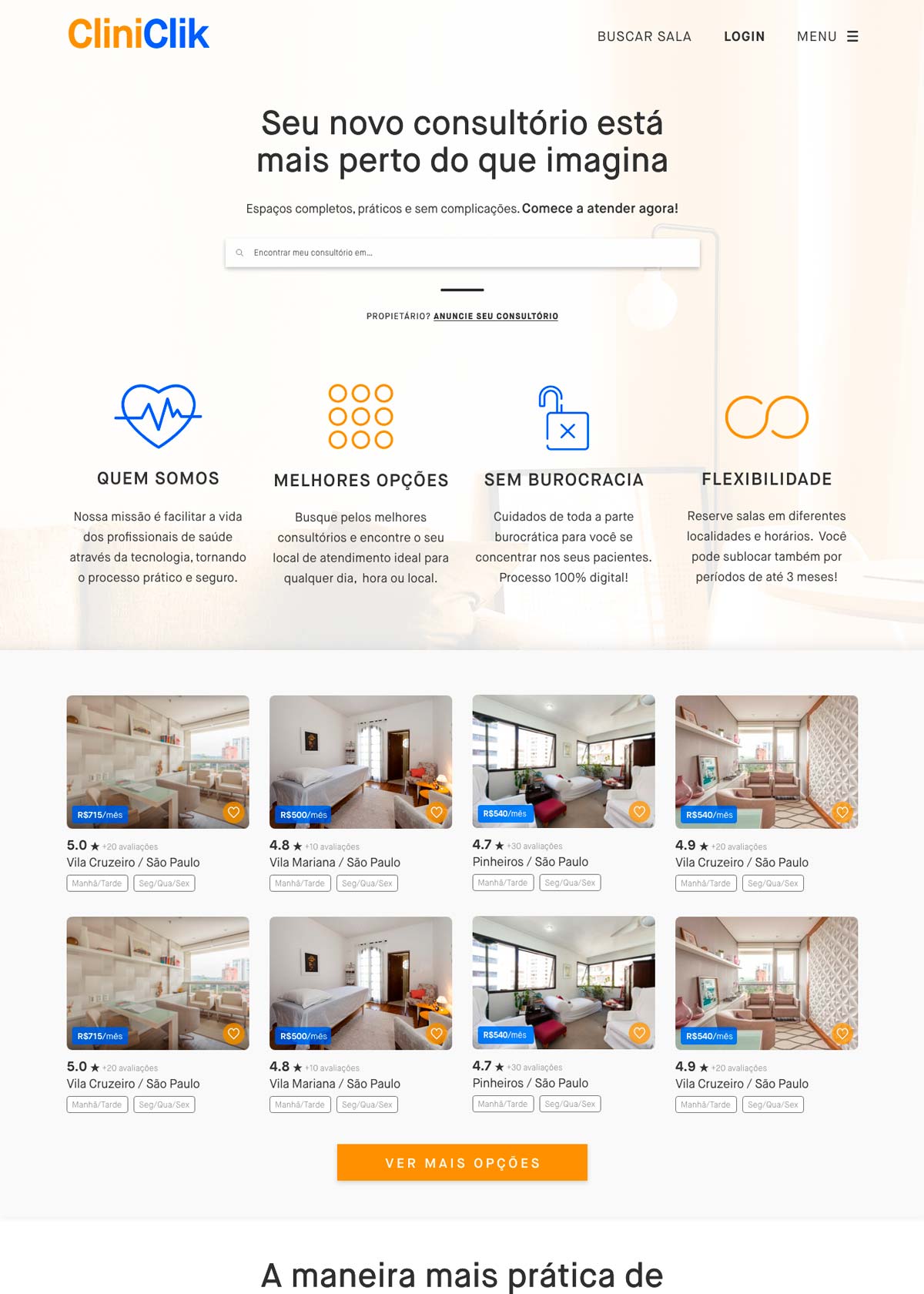
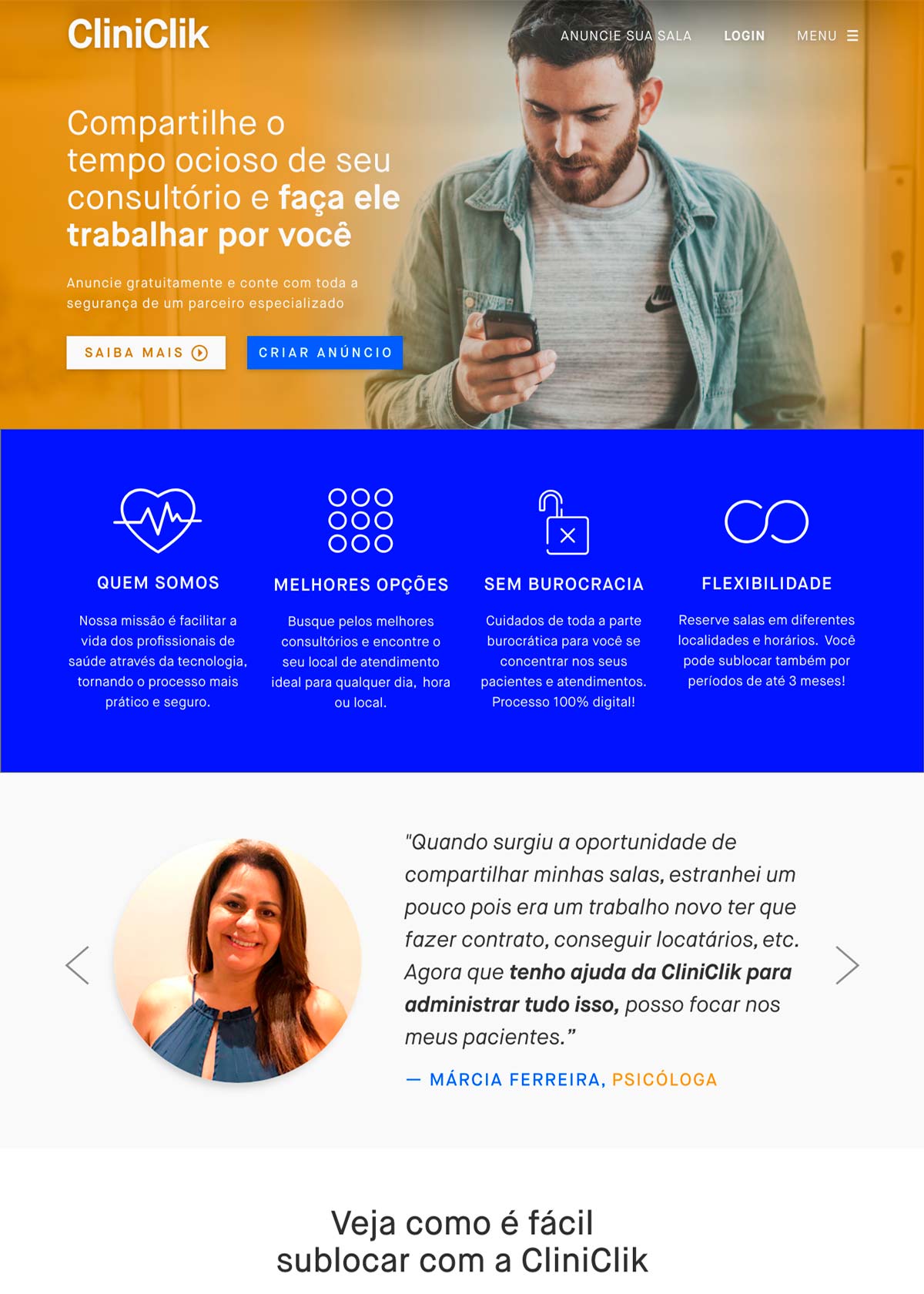
CliniClik is a platform that connects healthcare professionals, who want the flexibility of schedule an office with those who want to increase their income with the idle time of their spaces. I was the UX/UI lead designer in the following process that redefines the experience for CliniClik clients, a startup based in São Paulo, Brazil.
Goals
Make it simple, comfortable to browse and easily adaptable to other devices. Explore the UX process and the impact in the final design. Study and experiment with UI Design. Create an enjoyable experience for the customer.
Process
Analysis
Study the actual design and its performance. Make questions. Research.
Planning
Talk to people. See how they use the old website. What they think about it? Create personas and user journeys.
Information Architecture
Rethink the site map. Sketches, a lot of them. Wireframes. Low fidelity prototype.
Visual Design
Reference, as much as possible. Create, rethink, receive and apply feedbacks, create again. You’re done! 🙂
One of the main motivations that led the partners to search for this restructuring through UX, was the diagnosis that they were attracting several users, but the rate of abandonment of those who schedule a visit in one of the offices was quite high. So I started the process by formulating some hypotheses about what the platform’s current problems would be.
Hypothesis
1. CredibilityThe current website looks more like an ad website (ex. OLX.com.br) than a sublocation service. Therefore, users don’t know if the site is actually reliable. This kind of service is also very new.
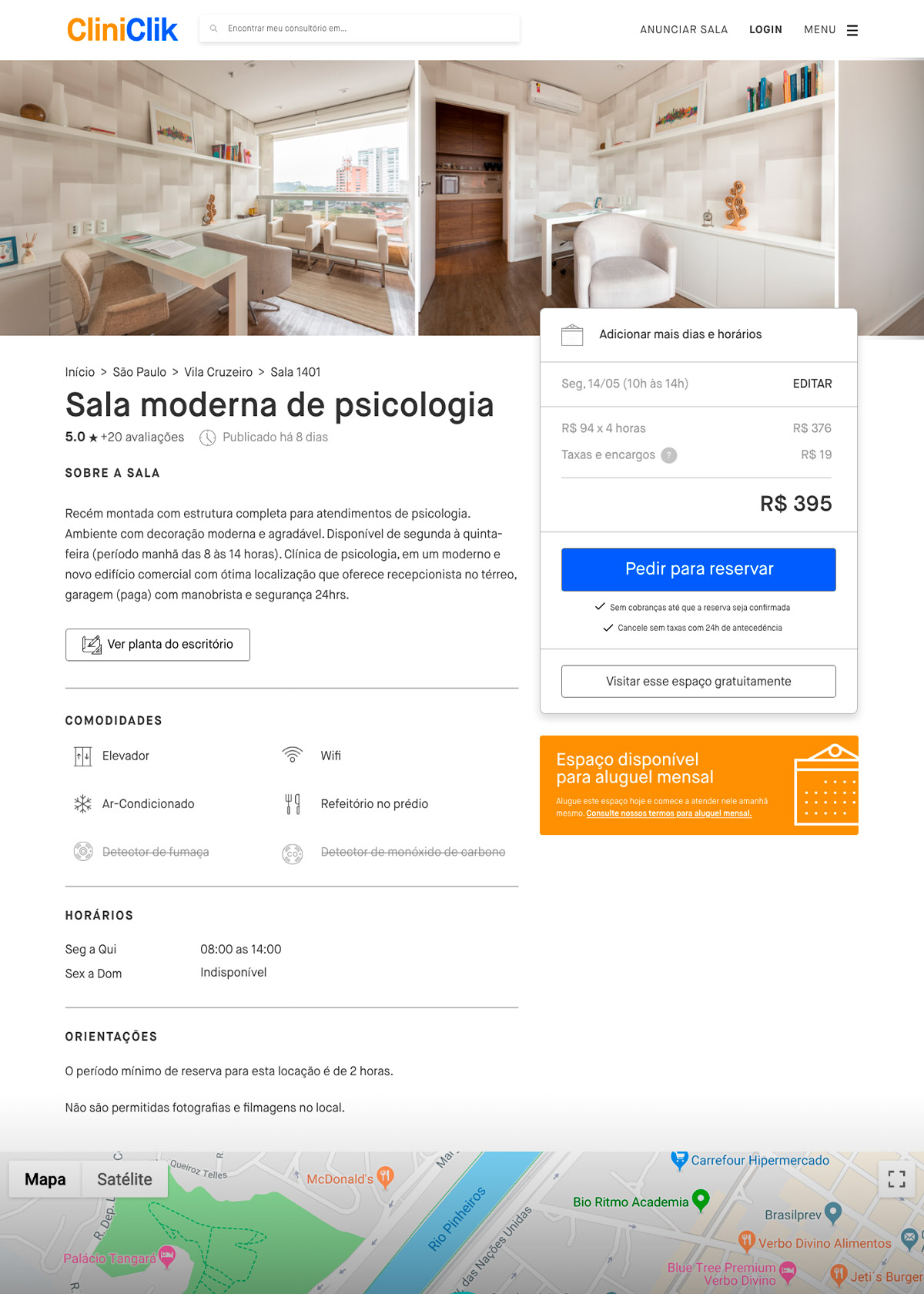
2. A lot of informationThe current website has a bad distribution of information. In addition, there is an excess of characters in all descriptive texts, which can prevent the user’s reading and interest.
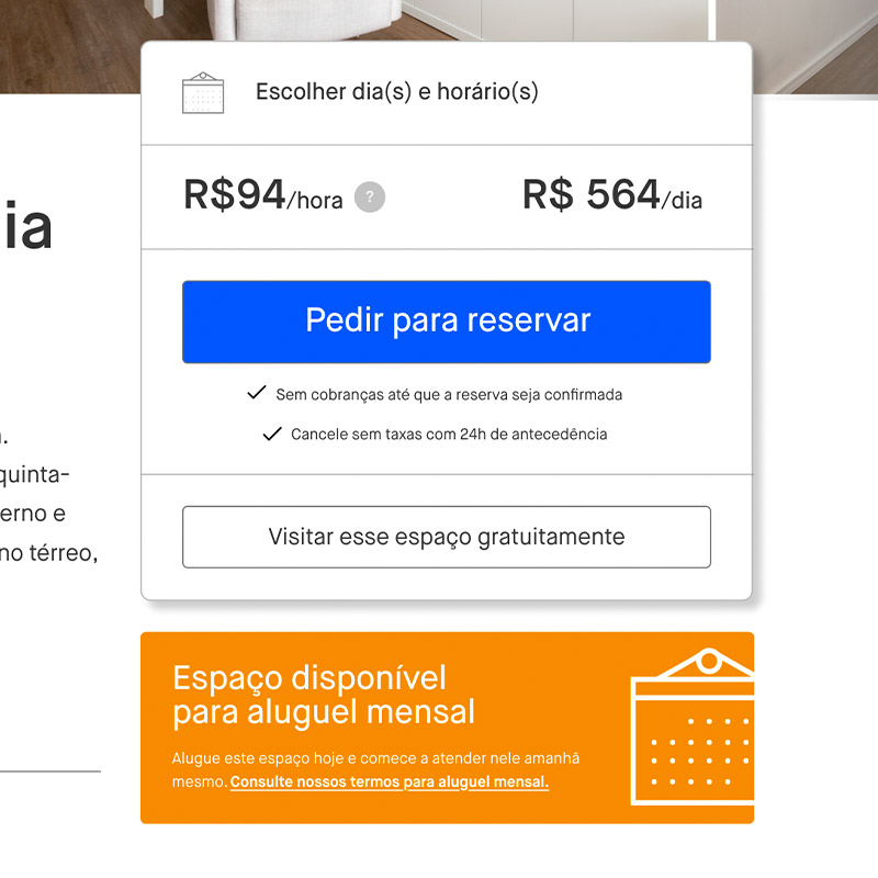
3. It’s a daily or monthly service?There is no way for a new user to know that the service only offers subleases for monthly periods. Which can be very frustrating, because it’s common for rooms to be sub located by the hour.
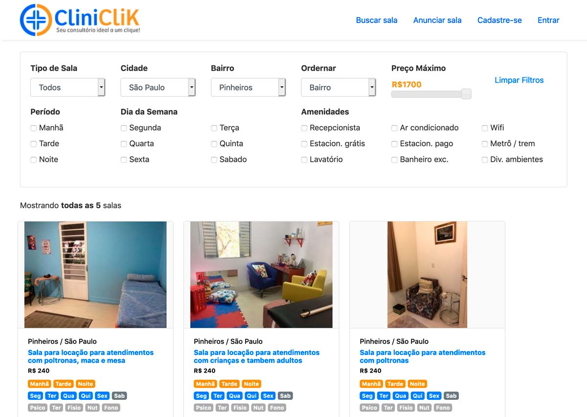
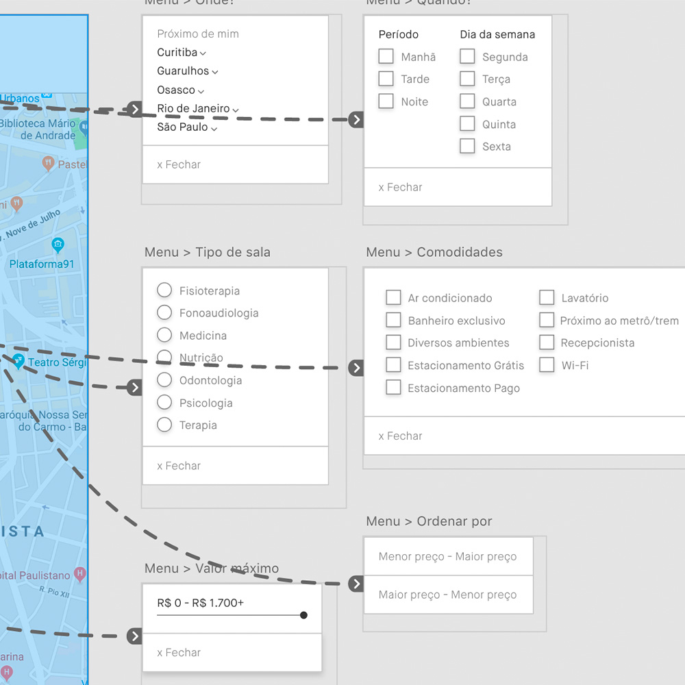
4. Search filtersThere is an excess of filters in the search and the disposition of information about each thing is also very confusing. Currently, even the unavailable info is shown on the products page.
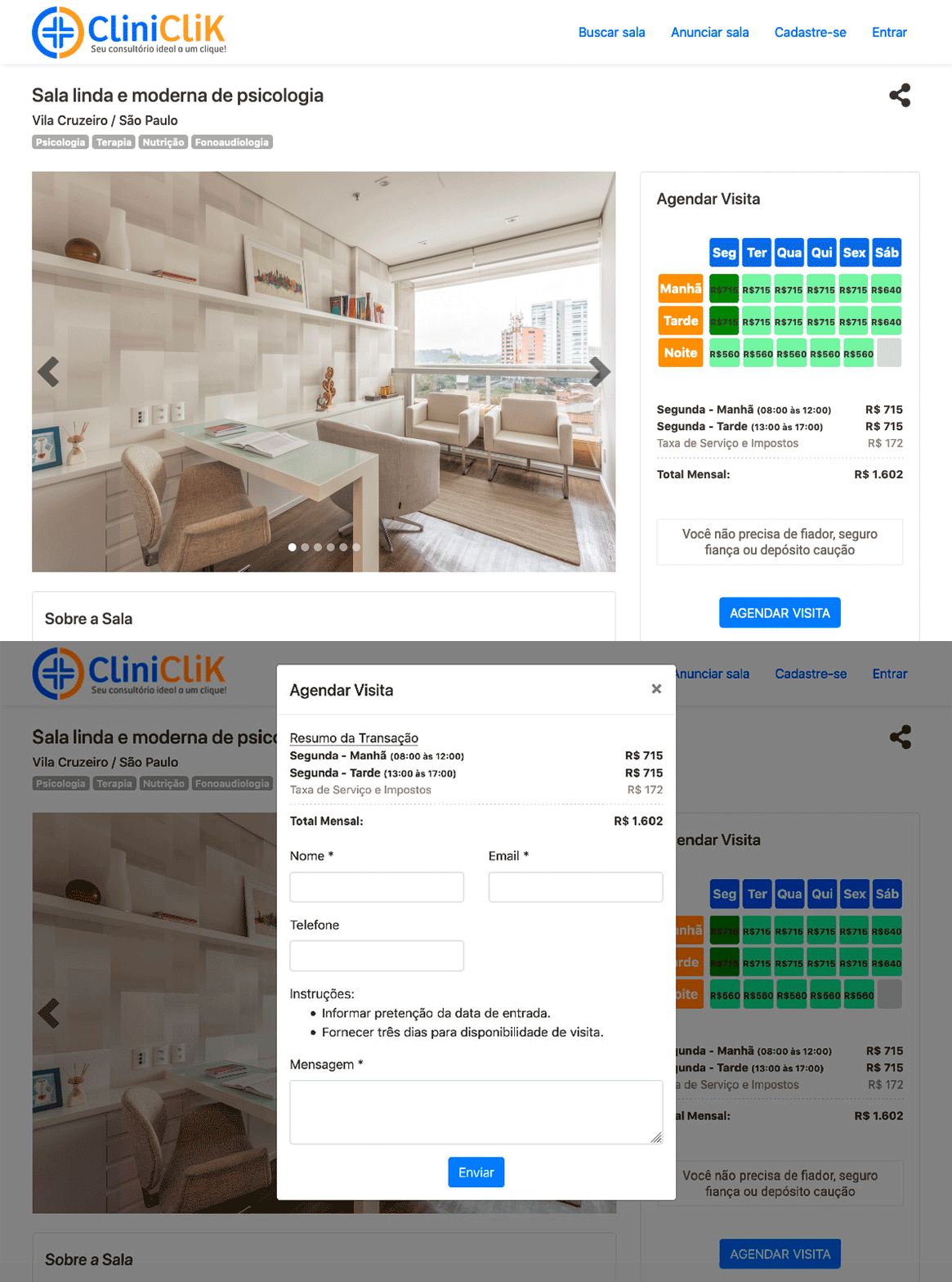
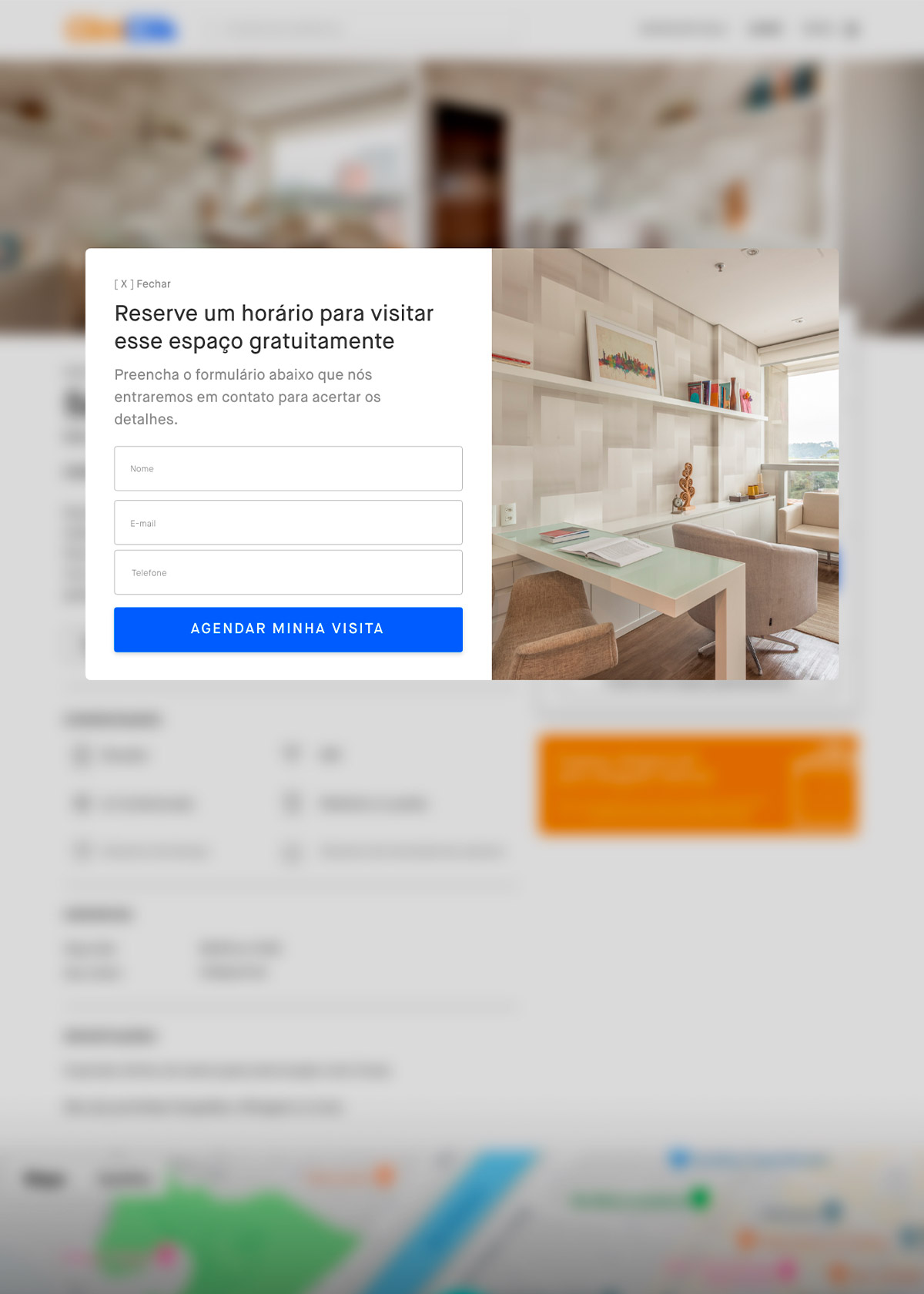
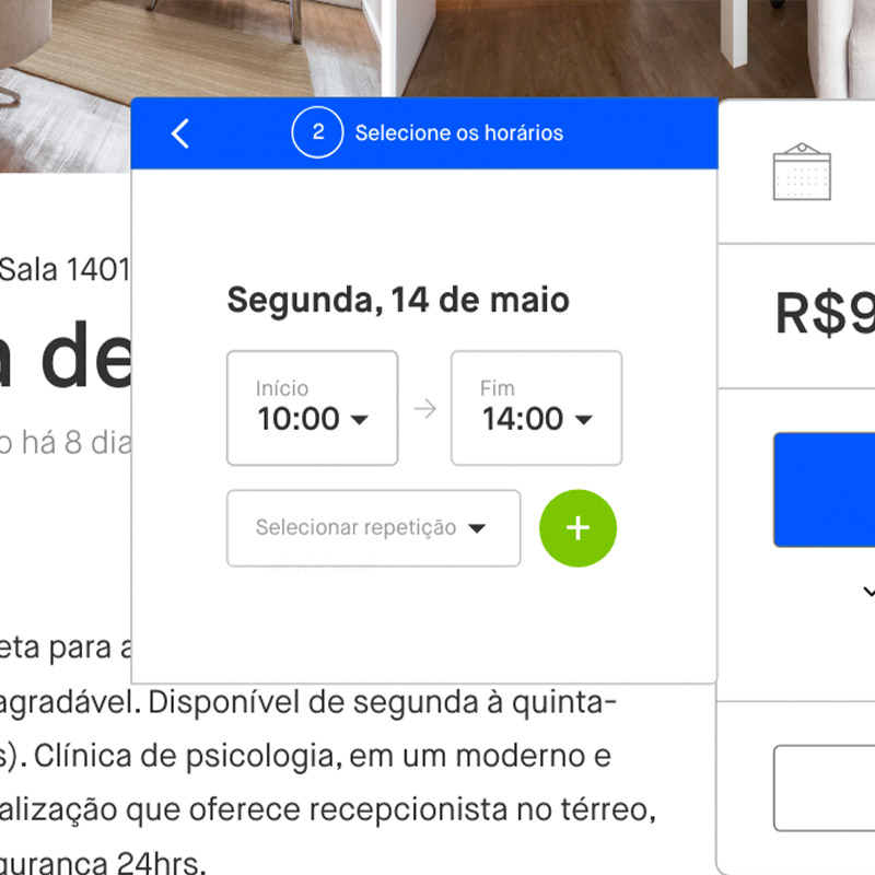
5. What’s the main action in the product page?Currently, on the office details page, the users choose when they want to schedule a visit, and clicks a button to “schedule visit”. Still, they are taken to a page that mentions a transaction with valours… Although they probably just want to know the space first. The scheduling and reservation flows are merged.
Research Steps
Quantitative research
Sending email to the entire customer base inviting them to participate in a quantitative survey, offering a small bonus to increase engagement. At the end of the survey, ask the users if they would accept to be contacted in the future to share more details. Through this data, find patterns of behaviour and formulate from that our personas.
Qualitative Research
Schedule interviews with some users. Preferably, each profile similar to those of the developed personas. Interview users with open questions to better understand their pains and needs. Give tasks to the users to perform on the current website, and gather the participants at the end to apply the Card Sorting technique.
Users Quotes (Personas)
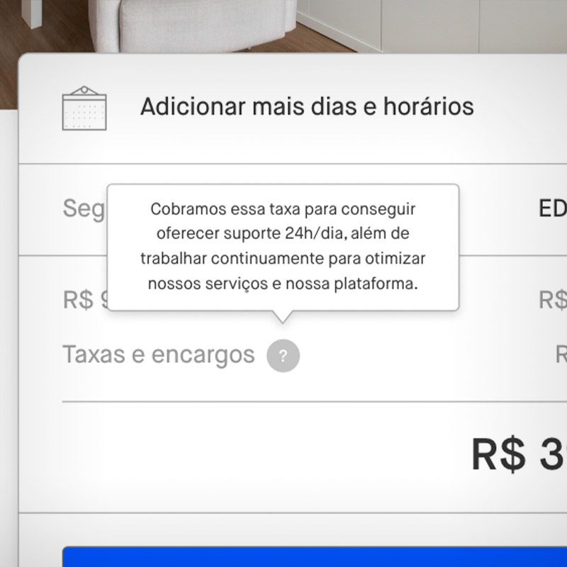
Cleno, 24/ Psychologist“I need to book offices online in an ease way. Platforms with no hidden fees and a effective support, like Airbnb and Uber, are my favourites.”
“I need to book offices online in an ease way. Platforms with no hidden fees and a effective support, like Airbnb and Uber, are my favourites.”
Lúcia, 44/ Endocrinologist“I don’t have a lot of free time, so I can’t deal with bureaucracies to rent my office, although it’s usually free in half period.”
“I don’t have a lot of free time, so I can’t deal with bureaucracies to rent my office, although it’s usually free in half period.”
Thiago, 31/ Psychiatrist“I can book offices for a minimum of 1 hours on other platforms and would not be interested in reserving for a monthly period, unless it worths.”
“I can book offices for a minimum of 1 hours on other platforms and would not be interested in reserving for a monthly period, unless it worths.”
Simplified Sitemap
RESHAPED UXPERIENCE
With great power comes great responsibility
After validating some of the hypotheses during the research phase, I coordinate a small design thinking workshop with the product team and stakeholders. The main idea here is to establish a consensus about our users’ pain points and needs. So, together, we are able to develop strong solutions and insights for our first high-fidelity prototype.
*Since more than 90% of traffic is on desktop, this specific project was not a mobile-first one.
